10 Creative Solutions to add Character, Colour and Community to a Retail Space.
How do you make a big change to the feeling of a space without a COMPLETE redesign? Illustration can be an affordable, easy and impactful way to give an environment a bit of oomph, making it a space people want to linger instead of move through as quickly as possible… We’ve worked with various retail clients and have found these 10 canvases are perfect for an illustrated touch, to further showcase what your space is about.
1. Vacant Units
Have a space that's currently not in use? Why not repurpose for a community mural, it could be temporary or more permanent!
Themed Mural for Mailbox Birmingham celebrating the King’s Coronation.
Mural for RSC’s ‘Like I Care’ project in an old shop unit.
Information for Fosse Foxes Trail in vacant units at the Fosse Park West site.
2. Floor
A great way to use a typically blank space which is in the eyeline of many phone users. A high slip rating ensures safety and the design could encourage interaction and movement in large uncrowded spaces to increase footfall and dwell time.
Floor Graphics created for Castle Quarter which celebrate their ‘Shop, Dine, Watch, Play’ offerings within the center.
3. Maps
Printed as a mural or shared digitally; Celebrate the location of your center and the local attractions on offer.
A printed Map Mural for Fosse Park West and Blaby District Council Project.
Local attractions showcase in the Castle Quarter Project
A Map to accompany a trail created by Rugby Art Gallery and Museum
4. Signage
Helps your audience use a space effectively, but who says they need to be dull? Have more fun using illustration to boost the visual appeal of a space.
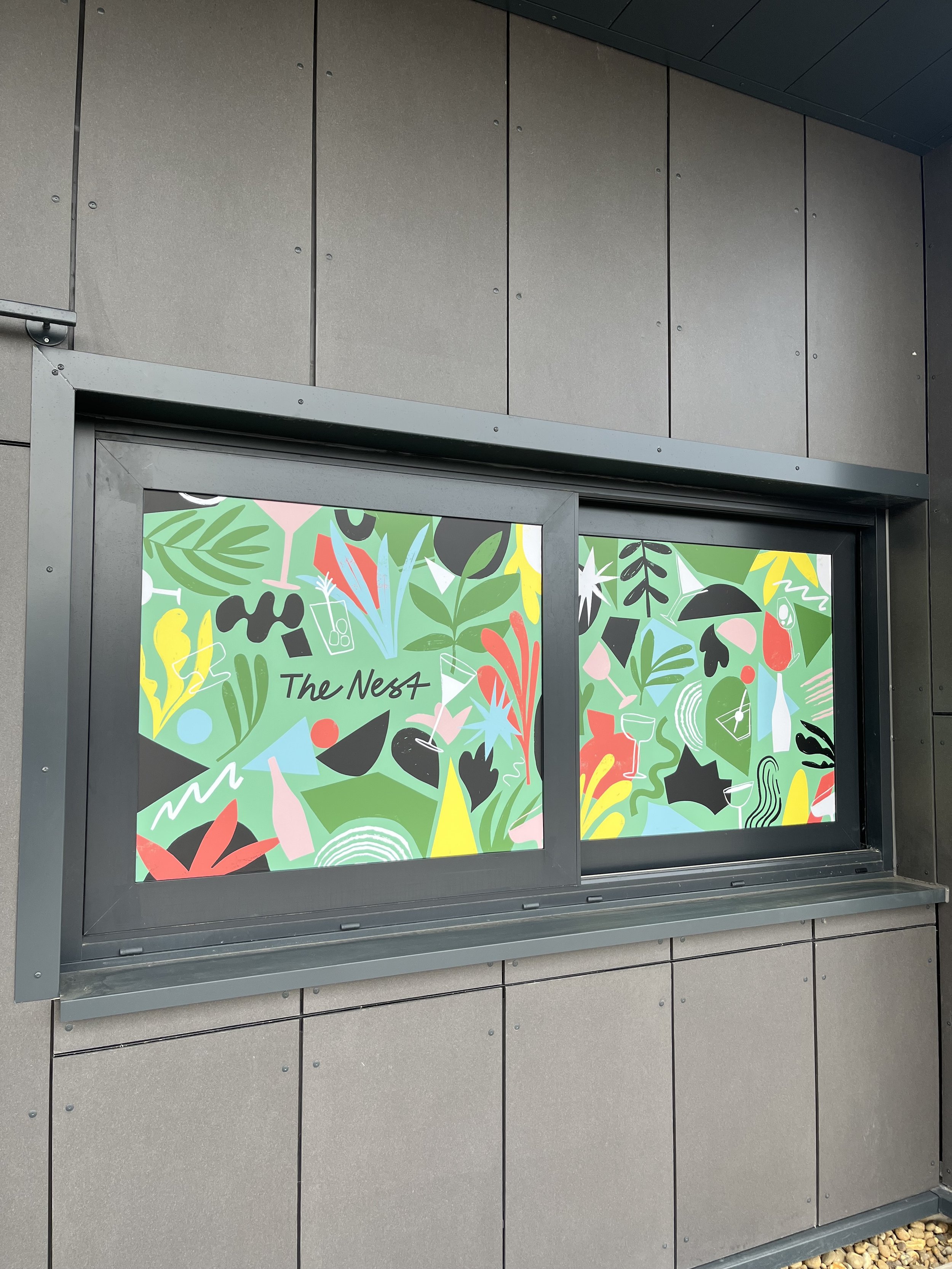
A vinyl mural used to signpost ‘The Nest’ bar at Phoenix Cinema
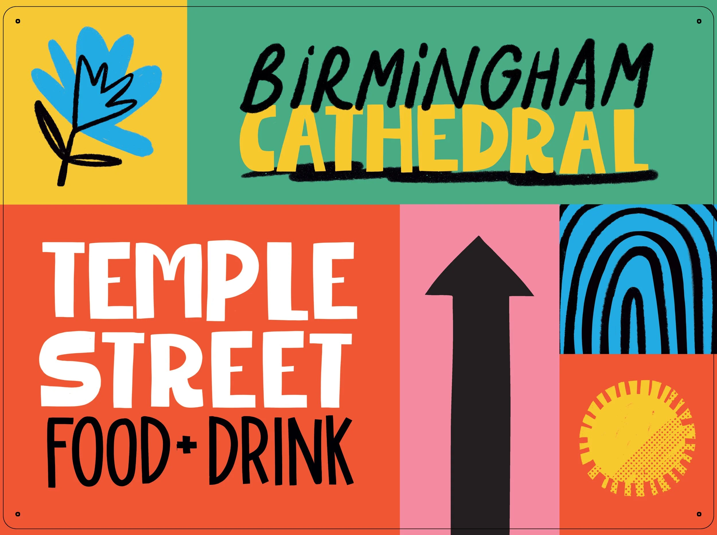
Signage created for Birmingham Central BID to be printed and used on planters.
5. Escalator
The dynamic shapes of the sides of escalators make a perfect canvas for graphics which could have a wayfinding element too!
6. Installation
Can range from a temporary printed card display to a more long lasting fiberglass trail/animal. There are many options for a ‘feature piece’ to make your site stand out from the rest.
Interactive printed wooden illustrations for National Trust’s Summer of Play Events.
Creative Printed Aluminium Signage for RSC Tongues in Trees project.
Fibreglass Fox Sculptures located around Fosse Park West creating an exciting trail for visitors to follow.
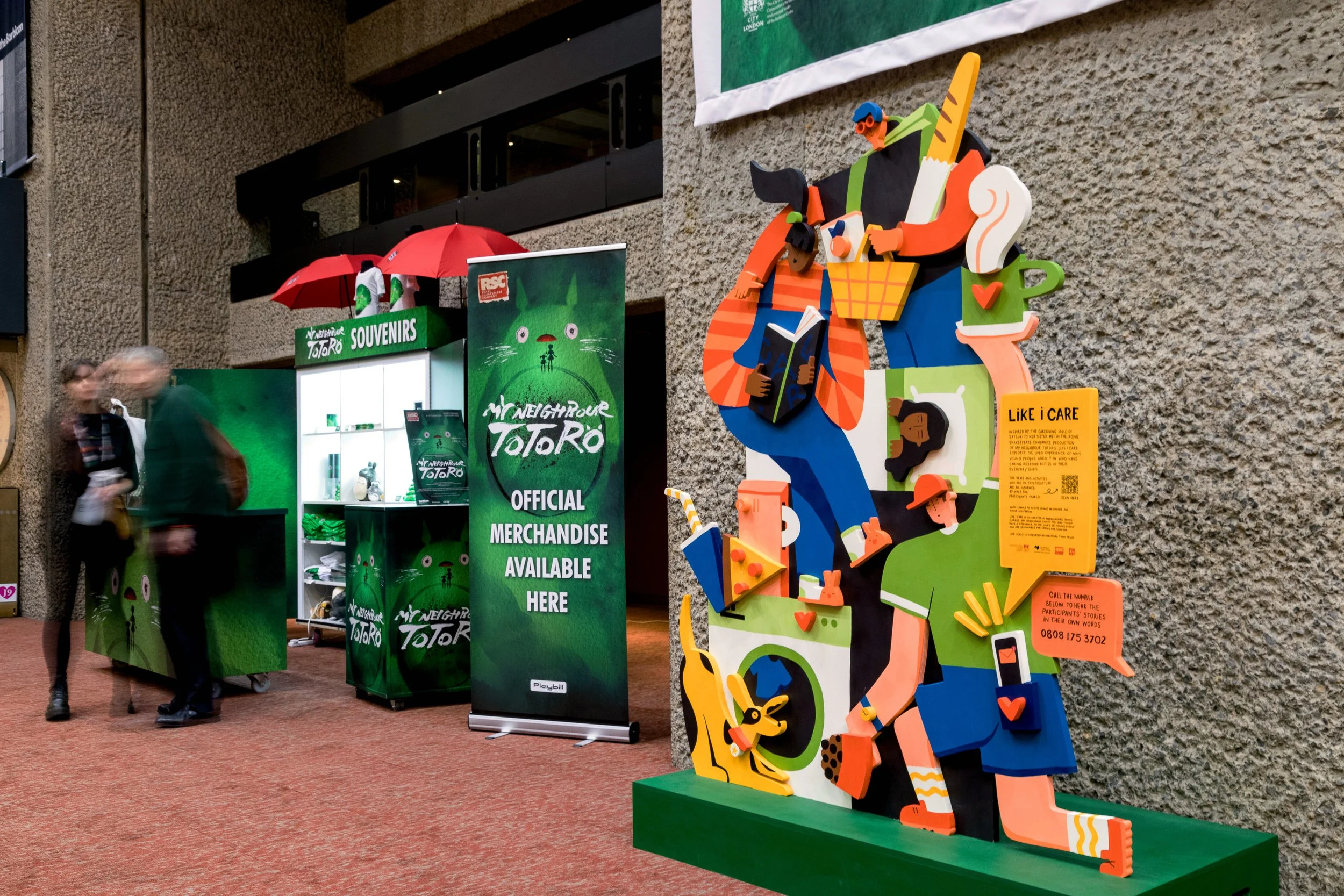
Painted Wooden 3D illustration for RSC Project ‘Like I Care’ showcased at The Barbican.
7. Windows
A window display helps to entice people into a space. Layered printed cardboard illustrations make a great impact and are sustainable, easy to install and cost effective!
Hanging card illustrations for The Exchange Cafe as part of an art trail through the city centre.
8. Pillars
A vinyl wrap can be added to pillars to make use of a typically underused space. Bold patterns work well for pillars to give a space some oomph.
Graphics were used around the entire Castle Quarter site creating a cohesive visitor experience.
9.Street Furniture
Using existing structures is a great way to save on cost and can have a big impact on a space. Paint a bench permanently, add seasonal printed boards to planters or tackle an outside utility box for a trail. All we have done in the past and create a stir in the community.
Painted Utility Boxes along a busy high street in Solihull.


